
Mobile Friendly Website Design: The Complete 2026 Guide to Getting It Right
More people browse the internet on their phones today than on any other device. If your business has a website that doesn’t work properly on mobile, you’re not just losing a few visitors — you’re losing customers, inquiries, and sales without even realizing it. That’s why mobile friendly website design has stopped being a “nice to have” and become one of the most important factors in whether a website succeeds or fails online.
In this article, we’ll break down exactly what mobile friendly design means, why it matters more than ever, and how you can bring your own website up to that standard — whether you’re starting fresh or fixing an existing site.
What Does Mobile Friendly Website Design Actually Mean?
A mobile friendly website is one that adapts smoothly to any screen size — phone, tablet, or desktop — without forcing the visitor to pinch, zoom, or scroll sideways just to read a sentence or tap a button. Text stays readable, images resize properly, menus stay easy to use, and the overall layout feels natural no matter what device it’s viewed on.
This isn’t purely a visual concern either. It’s about how the site actually feels to use. If someone lands on your page and struggles to find what they’re looking for, or a button is too small to tap accurately, they won’t stick around to figure it out. They’ll simply leave and go somewhere else — often a competitor’s site.
Why Mobile Friendly Design Matters So Much Right Now
Here are the real, practical reasons businesses can no longer treat mobile design as an afterthought:
1. Most of Your Traffic Is Already Mobile Across almost every industry, the majority of website visits now come from smartphones rather than desktops. If your site was built with only desktop screens in mind, you’re already underserving the bulk of the people who visit it.
2. User Experience Directly Affects Business Outcomes Easy navigation, fast loading, and a clean, uncluttered layout all work together to keep visitors engaged long enough to take action — whether that’s filling out a contact form, calling your business, or completing a purchase. A frustrating mobile experience quietly kills conversions before a visitor ever reaches your call to action.
3. Search Visibility Is Closely Tied to Mobile Experience Search engines pay close attention to how real users behave on a site — how quickly it loads, how long people stay, and whether they leave immediately after arriving. Sites that offer a poor mobile experience tend to struggle with visibility over time, simply because they don’t hold visitor attention the way well-optimized sites do.
4. First Impressions Happen in Seconds Studies on user behavior consistently show that people form an opinion about a website within the first few seconds of loading it. A slow, cluttered, or broken mobile layout creates a negative first impression before a visitor has even read a single word of your content.
5. Competitors Are Already Ahead If a potential customer compares your site to a competitor’s and yours takes longer to load or is harder to navigate on their phone, they won’t wait around to see if it improves. They’ll simply choose the smoother option.
How the Search Landscape Has Changed
Search engines and modern discovery tools no longer judge a website purely on keywords or technical checkboxes. They increasingly focus on whether a page actually answers what the visitor is looking for, and whether the overall experience — loading speed, clarity, ease of navigation — genuinely serves the person reading it.
In practical terms, this means simply applying a “responsive” theme isn’t enough anymore. The content itself needs to be genuinely useful and easy to consume, and the design needs to support that experience rather than get in the way of it. Businesses that treat mobile design as a real user-experience project — not just a technical requirement — tend to see stronger, more sustainable results.
Core Features Every Mobile Friendly Website Needs
If you’re evaluating your own website or planning a new one, here are the elements that matter most:
- Responsive Layout: The design should automatically adjust to fit any screen size, rather than relying on a separate “mobile version.”
- Fast Loading Speed: Images, scripts, and code should be optimized so pages load quickly, even on slower mobile connections.
- Simple, Thumb-Friendly Navigation: Menus should be easy to open and use with one hand, without hidden or overly nested options.
- Readable Typography: Text should be legible without the visitor needing to zoom in.
- Properly Sized Buttons and Links: Clickable elements need enough space around them so users don’t accidentally tap the wrong one.
- Clean, Uncluttered Design: Avoid excessive pop-ups, oversized ads, or crowded layouts that make the page feel overwhelming on a small screen.
- Optimized Images and Media: Visuals should scale correctly and load efficiently without slowing the page down.
How Mobile Friendliness and SEO Work Together
Mobile experience and search performance aren’t separate concerns — they’re deeply connected. When a site works well on mobile, visitors stay longer, browse more pages, and are more likely to convert. Search engines pick up on these positive engagement signals over time, which can support better visibility in search results.
On the other hand, a site that frustrates mobile users tends to see high bounce rates and short visit durations — signals that can work against a site’s search performance regardless of how good the content itself is.
If you’re serious about improving your website’s overall search performance, mobile design is only one piece of the picture. Technical structure, page speed, and on-page optimization all play a role too. Our SEO Optimization services cover this full picture — from keyword research to structural and speed improvements that help a site perform better in search.
How to Make an Existing Website Mobile Friendly
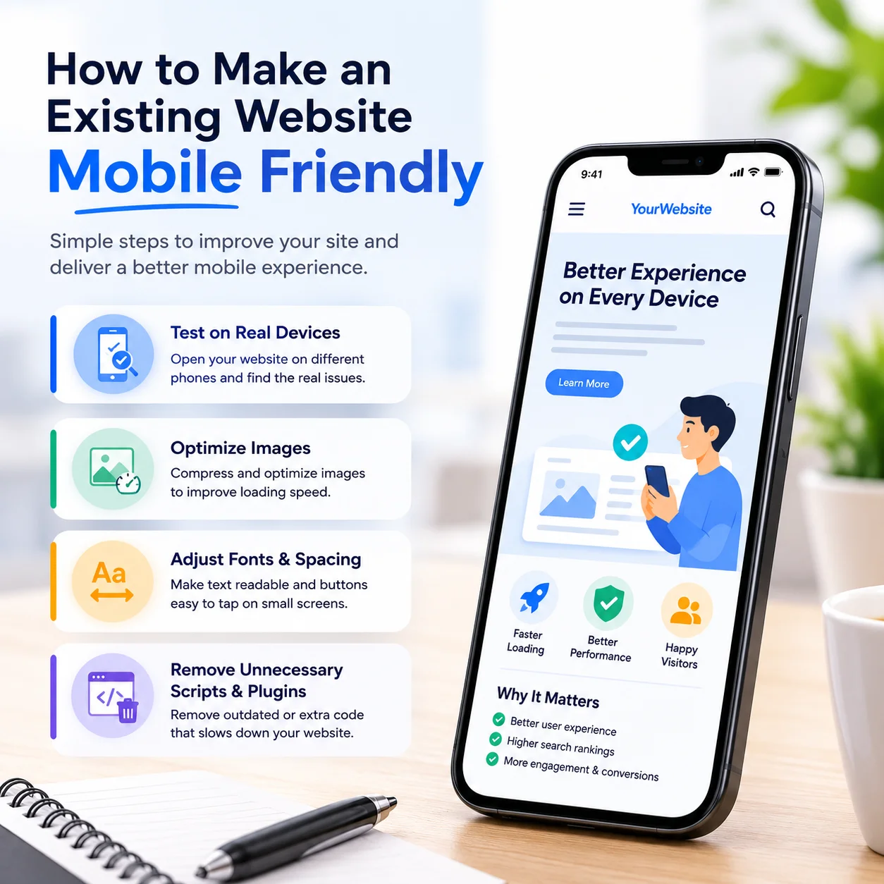
If your current website isn’t performing well on mobile, you don’t necessarily need to start from scratch. In many cases, targeted improvements can make a significant difference:
- Test the site on an actual phone. Don’t rely on assumptions — open your website on a few different mobile devices and see where the friction actually is.
- Compress and optimize images. Large, unoptimized images are one of the most common causes of slow mobile loading times.
- Adjust font sizes and spacing. Small text and cramped buttons are among the most frequent complaints mobile users have.
- Remove unnecessary scripts or plugins. Bloated websites often carry outdated code that slows everything down without adding real value.
- Simplify navigation menus. If your menu has too many nested options, consider streamlining it for mobile users specifically.
- Consider a full rebuild if the site is outdated. Sometimes patching an old website only goes so far, and a modern rebuild ends up being more cost-effective long term.
If you’d rather have this handled professionally, our Website Rebuild service is designed exactly for this — turning slow, outdated websites into modern, mobile-ready sites without losing existing content or search rankings in the process.
Building a New Website? Start Mobile-First
If you’re building a brand-new website, the smartest approach is to design for mobile from the very beginning, rather than building for desktop first and adjusting for mobile afterward. This “mobile-first” approach tends to produce cleaner, faster, and more intuitive websites overall, because every design decision is made with the majority of your visitors in mind from day one.
Custom-built websites offer the flexibility to do this properly, since every element can be shaped around your specific business needs rather than forced into a rigid, one-size-fits-all template. Our WordPress Development services are built around this exact principle — every project is developed mobile-first, so your site performs well on every device from the moment it launches.
What About Online Stores?
If your website includes an online store, mobile friendliness becomes even more critical. A large share of online shopping now happens directly on smartphones, and any friction in the checkout process — confusing navigation, slow product pages, awkward payment forms — can directly cost you sales. Product images need to load quickly, categories need to be easy to browse with a thumb, and the checkout process needs to be as simple as possible.
Our WooCommerce Store setup service is built with this in mind, ensuring product pages, payment gateways, and the overall shopping experience all work smoothly across every device.
Ongoing Maintenance Matters Too
Mobile friendliness isn’t a one-time fix. As browsers, devices, and content change over time, websites need regular attention to keep performing well. Broken plugins, outdated themes, and unoptimized new content can quietly erode a site’s mobile performance months after the original design was completed.
Regular monitoring, updates, and performance checks help catch these issues early. Our Website Maintenance service covers exactly this — ongoing updates, backups, and monitoring so your site continues to perform well on mobile long after launch.
Final Thoughts
Mobile friendly website design is no longer optional — it’s one of the most basic requirements for succeeding online today. Whether you’re launching a brand-new business or trying to breathe new life into an outdated website, prioritizing the mobile experience is one of the most effective things you can do to turn visitors into customers.
If you’d like a professional review of how your current website performs on mobile, or want to discuss a new project, reach out through our Contact page. We can walk you through exactly where your site stands and what improvements would make the biggest difference.
Frequently Asked Questions
Does mobile friendly design affect website loading speed?
Yes, the two are closely linked. A well-optimized mobile design typically goes hand in hand with faster loading times, since both rely on clean code, optimized images, and efficient structure.
Do I need to completely rebuild my old website to make it mobile friendly?
Not always. Many websites can be significantly improved through targeted fixes like image compression, font adjustments, and menu simplification. However, if the site is very outdated, a full rebuild often ends up being the more practical, long-term solution.
How long does it take to build a mobile friendly website?
This depends on the complexity of the project, but a standard business website is typically completed within a few weeks when built with mobile-first principles from the start.
Can an old website keep its SEO rankings after being made mobile friendly?
Yes, when the process is handled correctly. A careful rebuild or migration preserves existing content and rankings while improving the overall mobile experience.